Why the Airbnb pitch deck has over million views, and everyone wants to copy?
10 slides, bold font, strong color contrast. It seems like an easy pitch deck design formula.

Airbnb Pitch Deck redesigned by Zlides
10 slides, bold font, strong color contrast. It seems like an easy pitch deck design formula.
You followed step by step, but your presentation slides still look dumb. You wanted to hear a "wow" but turns out your audience falls asleep. How come your slides don't work like the Airbnb pitch deck design system?
Airbnb pitch deck was first revealed back in 2009, and it has contributed to their first investment. Since then, it has been widely spread internationally. It’s go-to teaching material at many accelerators, incubators, and hackathons.
Why Airbnb can, but you can't?
Let's tear down the Airbnb pitch deck (2009) slide by slide:
Cover
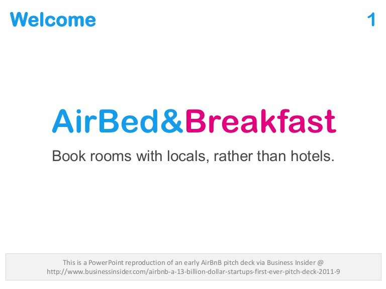
The cover page is also known as a splash screen, often displays at the beginning of your pitch or in between pitches. You should give your audience a quick overview of what you do. Company name, logo, and tagline. Your color & brand will also dictate the personality of your startups.
It's a pain when you see founders over-utilize the space of the cover page and end up deliver zero messages. Such as using super small font size, an image with wrong gradients that hurts your eyes, and all unnecessary logos from competitions and media.
Problem
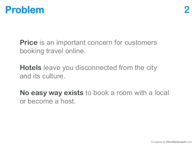
I bet your kids can read the 3 sentences out loud with no mistakes. That’s the beauty of simple and understandable languages. When you’re serving more than one customer group, you’re expected to present their pains. Your problem statement should be clear and highly correlated with your target audiences.
Let’s admit that. Many startups built a product to find its problem but not the other way round. Or the problem statement introduced without prior validation. You should always aim to perform a problem discovery process and listen to your potential customers.
Solution
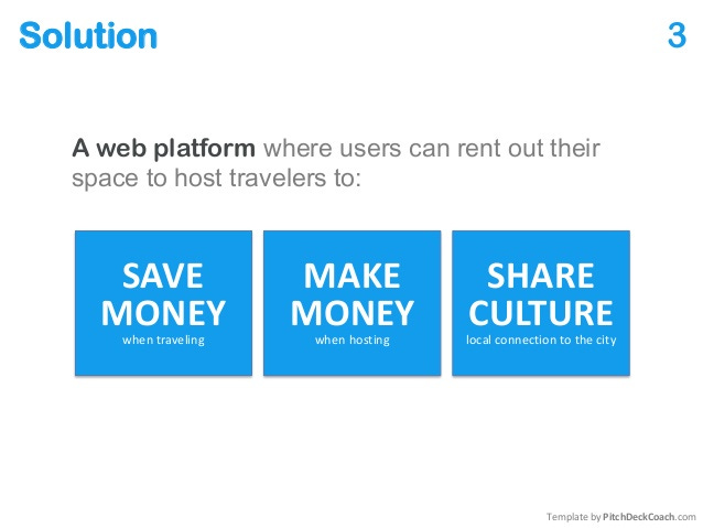
This slide would be better if they illustrate the relationship between hosts and travelers. You can see the three key solutions in bold that most Airbnb users are excited about. But remember, when every startup aims to save time, cost, resources and you still do the same. That’s not enough.
“We help marketers solve business problems using AI, Blockchain, and Big data.” You slide will be deleted immediately! Stop putting technical buzzwords to portrait you have got a good solution. Customers and investors don’t really care. You need to tell how your solution coherent the problem statements, again, in simple languages.
Market validation
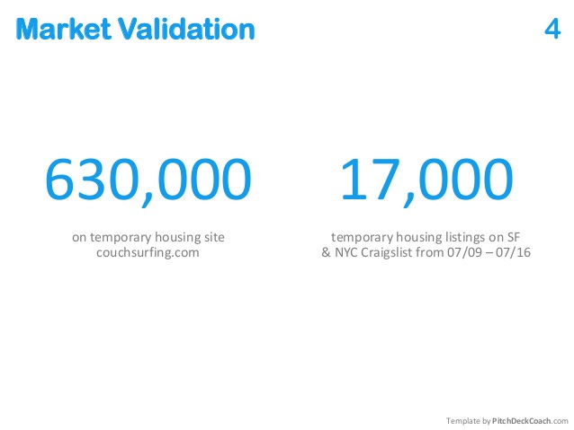
Back in 2009, there was no high-quality public travel data. Therefore, research from a third party may be the only way. Make sure to segment the data, identify the most credible source, and display only relevant data to get attention.
Sometimes the best chart is no chart. Wrong diagrams and messy statistics can confuse people. Your data should be clear so that people understand that their needs are not met quantitatively. Even if you are citing data from well-known research or industry reports, you must conduct quality checks because creating a pitch deck.
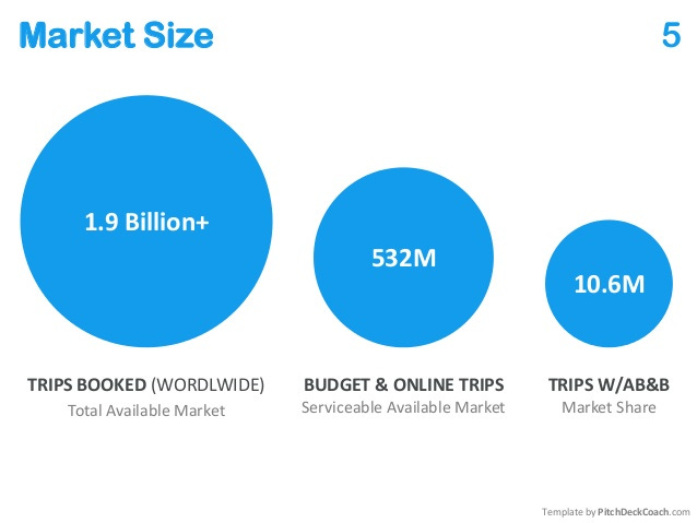
Market Size
Estimating the market size by segment helps your audience realize the potential. These three bubbles are intended to illustrate market share (SOM), serviceable target market (SAM), and total target market (TAM). You can always segment and expand the number by combining demographic information (such as gender, region, age group, etc.).
Remember last time you heard someone say "We are entering the $100B market, imagine we can occupy 1% of the market...". Either you are bad in mathematics, or your audience is dumb in economics. Show only a set of reasonable data you are confident to share. Not a numbers game without validation.
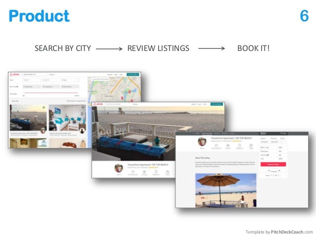
Product
It is important to show the most critical process of your product. Depending on the presentation settings, sometimes you do not necessarily need to demonstrate the entire product. Here, you can provide a preview of the 2-3 steps that define the experience of your customers.
Stop pitching the login screen, you are wasting time. All login screens perform the same function. You may be wondering, do we need to show real products, prototype, or videos? It depends, you should choose the best format based on the audience. There is nothing wrong with early-stage startups without products. And by the way Airbnb built their first product on Wordpress.
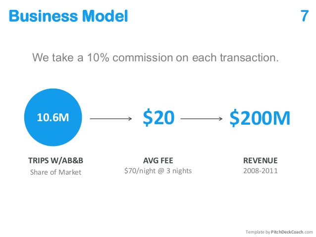
Business Model
Here, you can see the direct commission model and function of the two-sided platform. The more transactions, the more revenue they generate. Not to mention whether these numbers are realistic, but at least you can imagine how the business works, so it is the goal of the business model.
It is a pain when you see that a business model involves a lot of "arrows". The business model and revenue model are two completely different concepts. Don't be greedy in the number of stakeholders. Make your business model simple and easy to understand. You can always scale into new adjacent markets or start new business lines when your business is more mature.
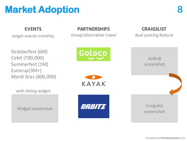
Market Adoption
Thanks to the flagship event and Craigslist. Airbnb managed to attract the attention of early customers by using time-sensitive activities. It is important to show how to identify like-minded market groups and ensure that existing resources can be useful.
Without a go-to-market strategy is like a rocket without fuel. You know where to go, but you didn't go all out. Present the most relevant channels, where you can acquire relevant customers on a large scale.
Competition
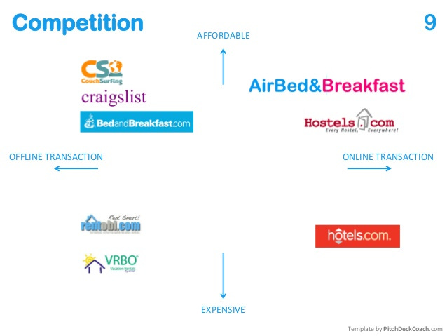
The X-Y axis graph (aka perceptual map) is used to compare two extreme parameters: Affordability (Y) and Transaction method (X). Compare to the right company and discover the potential gaps where your startup can play a role in the market.
No competition is a problem. Either you may not have conducted proper research, or you may not understand customer behavior. You should always monitor your direct, indirect, and neighboring competition.
Competitive Advantages
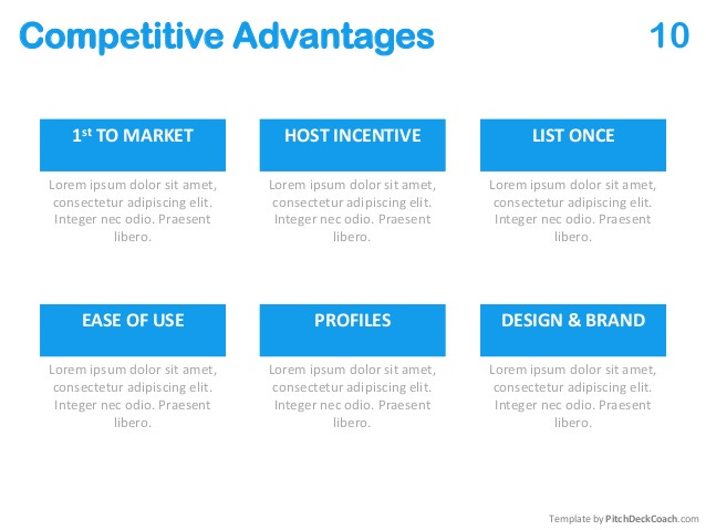
Now, what makes your startup company better? Show any unique features and advantages that your competitors lag behind, or products you can add value to make your customers' lives easier.
What your competitor can't do does not mean you should do. Anyone can build features, but this does not mean that your customers need these features. Always validate and think from the perspective of problem-solving.
Team
This is a slide that has never been publicly released. But did you know that Airbnb started with two designers? Yes, the first CTO joined for a while after their idea was born and only worked part-time. Team and execution are so important. Find a way to explain why your team has a good combination, relevant experience, and domain knowledge.
This is a big signal when the team prioritizes their academic background and the company they have worked for before. These glories are totally useful and it can bring you credit. When you are in a small venture. People expect to see new sparks from your team. And what would be the future looks like.
Ask
Each pitch deck should be equipped with a unique goal. No one pitch deck that can adapt to all situations. Imagine selling in front of investors, customers, partners, and talent. You need to apply for different languages.
Always customize your presentation and respect your audience. Put forward some relevant content and make them say "yes". People are smart enough to hear if your objectives match their goals. Be very specific and to the point.
Your turn
These slides are just the basic framework that you should refer to. It has been widely spread because of its simple pitch deck design and clear presentation structure. And of course the unicorn effect. But doesn't mean you cannot do the same or better.
When making a new pitch deck, challenge yourself in terms of the content, design, and storytelling:
How does the content structure work?
What design concept was applied?
Why is this pitch deck perfect for storytelling?
Try it out and share your pitch deck design publicly. Looking forward to see your designs.
Image credits: Malcolm Lewis
Get your Zlides now
Zlides is created to everyone. Presentation design for great ideas. Follow us on Instagram, Pinterest, and LinkedIn for more updates.


