
Creating presentation slides: sometimes the best chart is no chart
Remember the last time you saw a chart but didn’t know where to start reading the presentation slide?


Remember the last time you saw a chart but didn’t know where to start reading the presentation slide? Does a startup use trend lines without numbers to illustrate their predictions?
Don't laugh. It happens all the time.
As a presentation designer, your mission is to help your audience digest information. Don't make them think. Sometimes the best chart is no chart. When you need to communicate numbers, use numbers. You can also use color contrast, font size, and images instead of charts. Also, displaying numbers with the appropriate units can help you achieve your presentation design goals.
Let's take a look at 5 examples that illustrate how to convey numbers on the presentation slide without any charts.
Tip #1: When including multiple metrics on one slide
Tip #2: When communicating revenue
Tip #3: When communicating customer acquisition cost (CAC)
Tip #4: When communicating market validation
Tip #1: When including multiple metrics on one slide
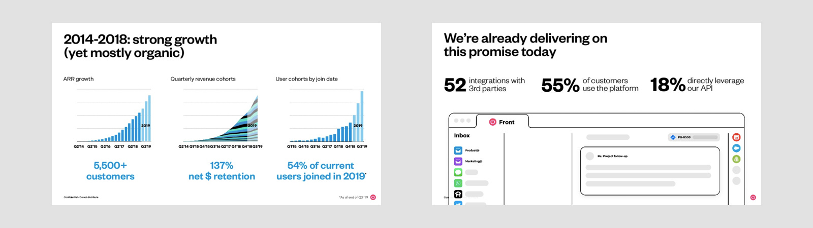
Front Series C pitch deck designed by Mathilde Collin, CEO of Front
Show'em all. Do you want to impress your investors with all the metrics that can be carried out? Want to display your key metric in a chart format to attract customers? But what if you are given one presentation slide only?
Whether a chart should be drawn is not a debate. But we want to explain how to display numbers. I am a big fan of the presentation slides designed by Mathilde Collin, CEO of Front. You can find two examples below. Impressive growth in 5 years (left) and key product indicators (right).
These presentation slides have one thing in common: three metrics of the same category are packaged in one slide. But the difference is that a slide contains charts and vice versa. Can you imagine what will happen if we remove the metrics and units on the left? It’s hard to tell the story from the bar charts, right? In contrast, you can easily find the messages in bold from the other presentation slide.
When you need to display multiple metrics on one presentation slide, consider how to optimize white space, charts, visual effects, and supporting text. Highlight the most important items to help readers digest information easily. Select a diagram carefully and make sure that people who are not familiar with diagrams can understand the meaning behind it. You will realize that sometimes numbers speak for themselves and draw important directions without any charts.
Tip #2: When communicating revenue

Financials model designed by Beth Susanne (Left)
No idea how to explain revenue forecasts to your investors? Responsible for introducing your revenue goals to your boss? Don't know how to effectively visualize the revenue model on presentation slides? you're not alone. Many people fail to provide revenue reports because they lack knowledge of segmentation and time series.
Subscription is a common model used by companies like Spotify, Netflix, and Dropbox. The concept is very simple, you can enjoy high-quality service by paying a small monthly fee. When we translate this information on the presentation slide. You should bear in mind to explain: how much money you make each month, how often you will add/drop a subscriber, and how you will use the best revenue channel.
Some industries are highly dependent on seasonal factors, such as e-commerce and travel. You can give the overall revenue factor by cohorts, and show that the revenue is very good in a time series. Use relevant vector icons and visual effects to support your communication.
It is not enough to explain revenue with ups-and-downs lines. You should always find a way to visualize how you make money, when you start making money, how often you make money, what are your main channels, etc. When preparing presentation slides related to revenue, always question yourself, and do not afraid to be creative.
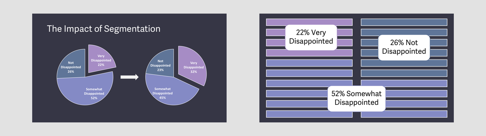
Tip #3: When communicating customer acquisition cost (CAC)

Tip #3: When communicating customer acquisition cost (CAC)
Customer Acquisition Cost (CAC) is the total cost of marketing activities needed to acquire customers. It is used to define whether your company has a viable business model. A positive CAC means you can continuously reinvest in marketing costs as you grow.
People often mix up revenue performance and incorrectly average CAC from all channel combinations. Ultimately, this will confuse your audience. Let take a look at two scenarios when you include CAC in your presentation slides.
When you compare the Lifetime Value (LTV) with the Customer Acquisition Cost over time (left). The presentation slide shows the rate of change under the same CAC but different LTV. That means the company needs to pay attention to a cyclical factor.
How about an alternative view of CAC? (right) There is no diagram, just a simple illustration. You can easily tell the difference between input and output. It gives you an overview of your customer acquisition effort based on marketing channels and what you need to do to optimize the cash machine.
Tip #4: When communicating market validation
Superhuman product-market-fit
You probably have heard a lot of market validation, especially in the startup scene. This is a key process to understand whether your company is of interest in a particular market. It consists of qualitative and quantitative factors in the target market.
It is important to verify before investing time and resources. Speed and sample size are the key factors that determine the success of idea validation.
"83% of people expressed their willingness to try our products for free." "69% of women expressed their willingness to buy cosmetics every month." Sound familiar, right? Like your idea is different from using your product. And this is just part of your market validation.
Successful market validation includes your customer profile, the adaptability of the solution to the problem, and the actual data used to demonstrate the product performance, which has been used by real customers. You don't need complicated charts to display the results. Show real numbers, use simple phrases, and color contrasts to describe your validation.
What next?
These are just a few ways your presentation design will improve by applying the right visualization technique. You should always come up with your own strategy, especially in communicating important metrics.
Why not give it a try? Redesign your presentation slides with or without charts, challenge yourself to communication metrics without charts.
Get your Zlides now
Zlides is created to everyone. Presentation design for great ideas. Follow us on Instagram, Pinterest, and LinkedIn for more updates.